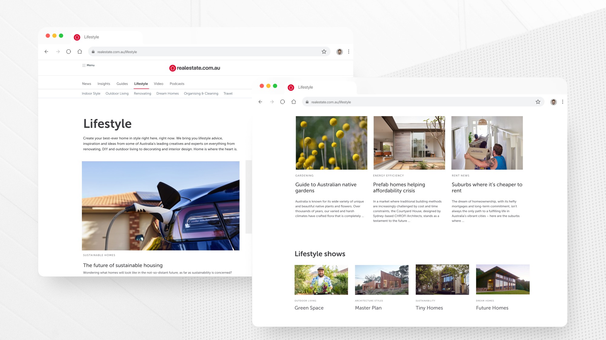
The ‘Lifestyle’ and ‘News’ segments on the realestate.com.au website had been essential to fostering engagement, educating audiences and driving traffic. As technologies and the content creation landscape was evolving, it was time to optimise it’s engagement as well as to transition the web experience to the newly created relestate.com.au app.
A user-centric approach
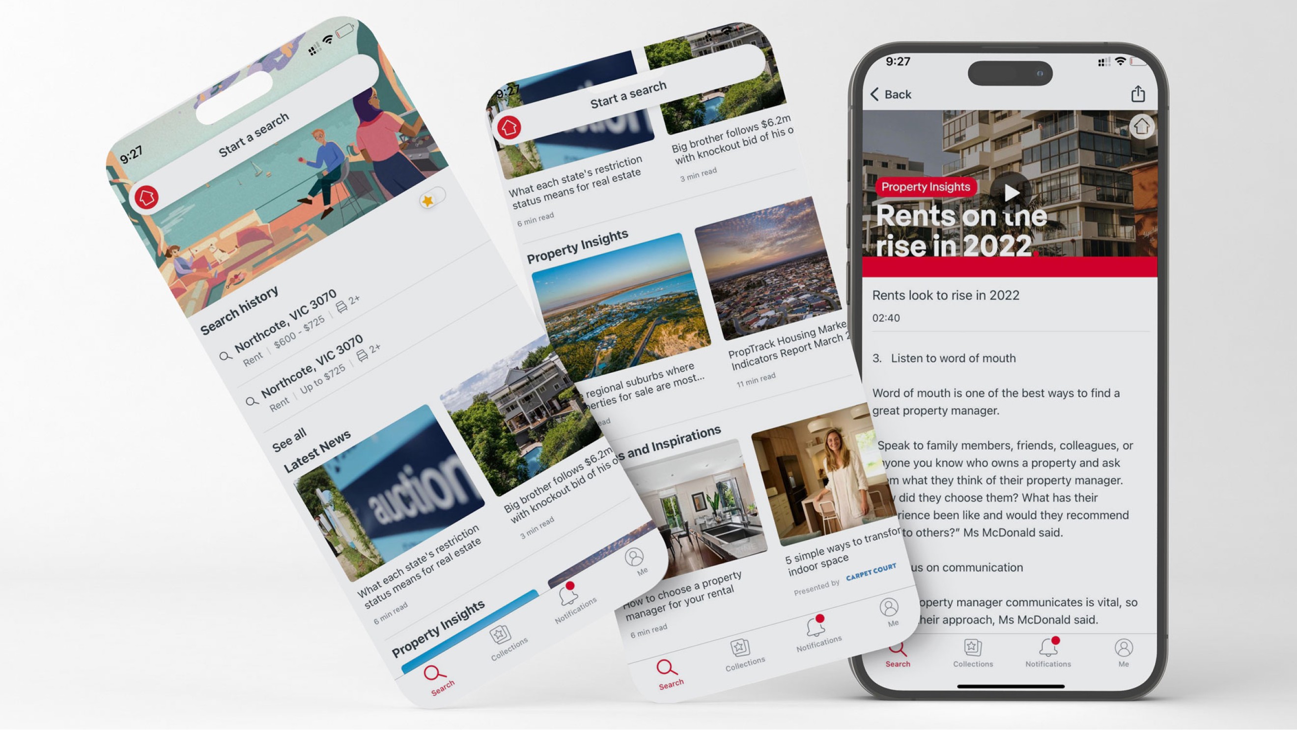
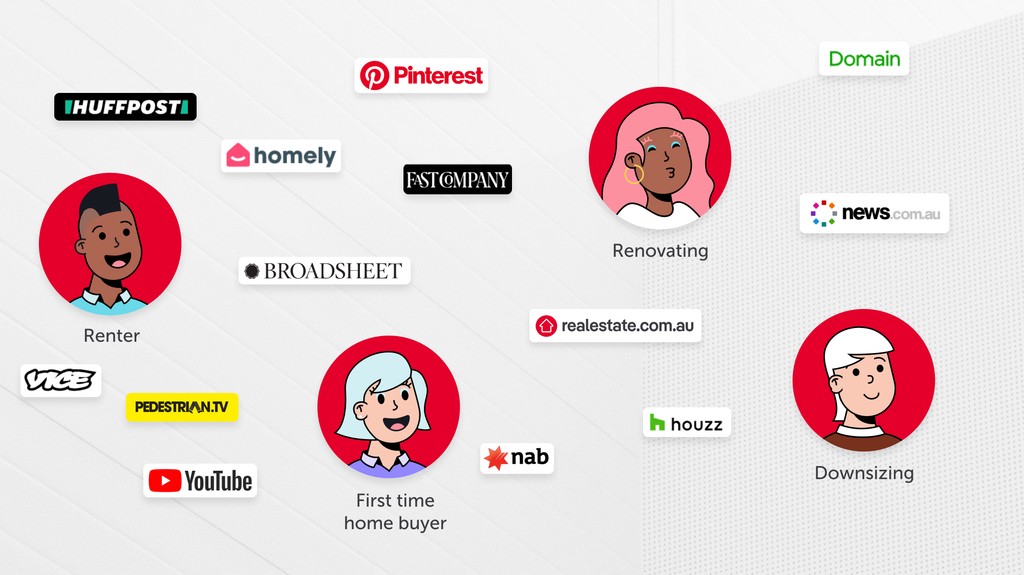
User testing emerged as a pivotal phase in our design journey to understand the diverse needs and preferences of individuals in varying stages of their property journey. Our approach was holistic, encompassing not only the direct interaction with our platform but also observing user behaviours across a spectrum of mediums, including Pinterest, YouTube, magazines, podcasts and home-lifestyle websites.
Through observation and inquiry, we delved into the dynamics of user engagement with the content and how each medium was used throughout their current property journey. Users expressed an inclination towards sharing information and articles within their social circles, video content emerged as a dominant theme (particularly among individuals harbouring aspirations of renovation) and a preference for platforms that had streamlined content and intuitive experiences.
Enhancements
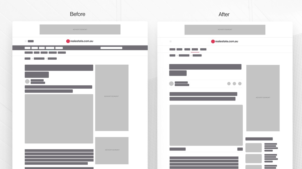
Through a comprehensive analysis of news and lifestyle websites coupled with user testing, I identified key areas for enhancement within the lifestyle and news article pages. Focusing on the pillars of article shareability, traffic drivers, video integration, captioning and categorisation. Honing in on these aspects would have the most significant impact in user engagement and accessibility.
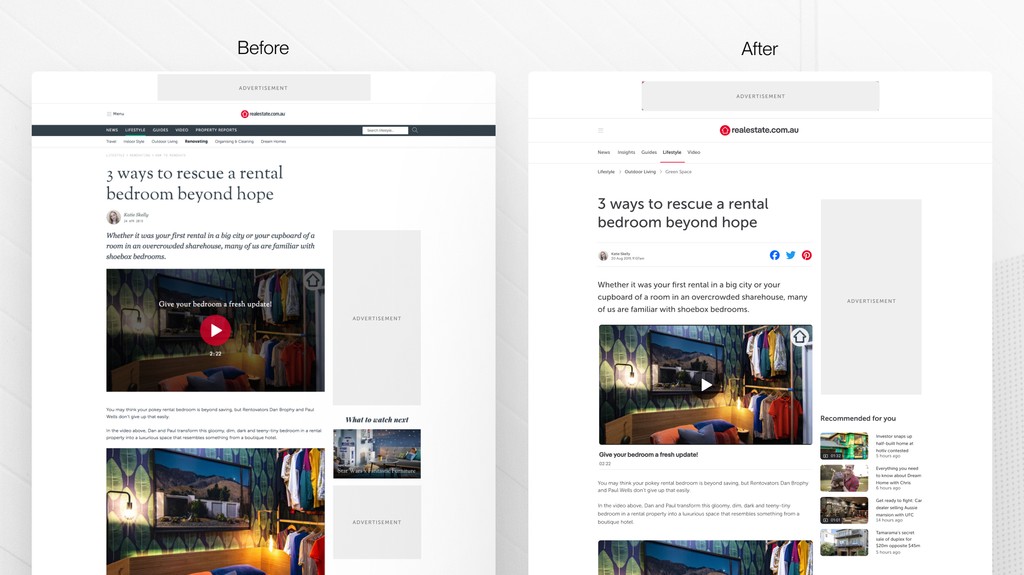
The above figure illustrates my proposed wireframe design focusing on the top-of-story configuration. The design encourages article shareability with the introduction of social share icons; suggested articles and videos above the fold to drive traffic to related content and video captioning which includes a play-time duration to improve accessibility and drive engagement.
Facelift
Changing the font headings to Museo was a strategic decision aimed at aligning article pages with the overarching branding of the website. Consistency in font usage across different sections of the website is crucial for brand recognition and establishing a cohesive visual identity. The switch to Museo enhances readability, as it avoids the complexities of the italic display fonts that were being used, ensuring clarity and legibility of headings. Additionally, the adjustment in font sizes improves accessibility.
The colour green was used throughout the Lifestyle pages (seen in the before navigation panel). We chose to change the green colour to red to unify the visual identity with the rest of the website and strengthen brand recognition. The switch to red not only reinforces brand consistency but also mitigates the risk of confusion with competitors.
Role
Working with a team of UX designers I worked across the discovery, define and design stage of the project.
Results
This project came to a halt in 2020 with Covid 19 and my departure from REA (hence no stats to share).
I would have worked with the team to acquire stats on number of article shares, video engagement and page view time on articles. As well as further user testing to gain an understanding of how users are interacting with the article on app and where it falls in the members journey.